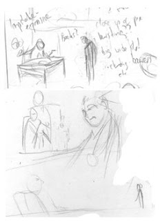
 Stage 2: On A3 paper (which I'm trying out in place of boards) I sketched out the shape of the characters with blue lead (so it can be removed in photoshop)
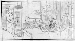
 Stage 3: Then I started filling in the pencils on top of the blue lead. While these aren't very loose, they aren't completely finished either, but tight enough not to leave huge pencil marks when I erase/tighten up. I think I also lowered the height of the walls at the back and the character in the middle slightly. The blue in the panel was removed after I scanned it.
 Stage 4: Pencils tightened up. I was planning on scanning and printing straight from pencil so I had to keep them very tight. A.k.a no scribbles.

Stage 5: Added some texture, filled in the black areas and added some flat colours in Photoshop. Stage 6: Built colours on top of the flats.
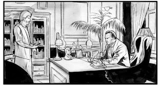
Stage 7: I decided I wasn't happy with the straight from pencils approach. Everything looked a bit flat, and didn't really suit a gritty crime book, so I experimented by light-boxing the original pencils onto a new A3 sheet and finished it in ink. I also flipped round the character in the centre so that it followed the reading flow.
Stage 8: I thought the background looked a little light compared to the forground, but didn't want to cover the whole thing in ink incase it didn't work, and also didn't want to re-ink the forground figure. So I scanned and printed a slighty washed out version of the panel and brushed a lot of ink over it. I thought I'd keep the inks loose to fit the gritiness, then scanned and pieced together the forground and background in PS.
 Stage 9: Added some colour. Looked at the finished page. Didn't like it at all.
Stage 10: Redrew entire panel (and rest of page) but managed to salvage a lot of stuff by lightboxing and varying it slightly. Decided to go back to the sideview. The panel looks a little less dramatic, but I think it works better as an establishing shot of these two characters in their environment. Also decided that the minders could come as a suprise in the later panels.
 stage 11: Threw out the idea of going straight from pencil and inked the page (with a little greyscale pencil shading thrown in.)
Two versions of the whole page, the first loose and trying to be stylised, the second with a lot more clarity and precision. Much happier with the second.


I'm exhausted just remembering it all.
Before I sign off, don't forget the Cancertown signing in FP belfast this coming Saturday 30th May. More info here
Stephen

Sir, you work too hard.
ReplyDeleteLike I kept saying all the way through Cancertown, it's fascinating watching the art come together like this. Seriously, it's the closest thing to real magic I can think of.
ReplyDeleteReally glad to be working with you on this, mate.
Cy: Same to you, but dont forget your magic floating ball so I can see it at Brum
ReplyDeleteReggie: I agree :) but it's not really work.
Thanks for sharing how you work, it's amazing which tweaks make a huge difference. I was surprised by the difference it made turning the character reading. It's also interesting how the image evolves. I might have to see if I can incorporate some of the evolution in what I do.
ReplyDelete